Create a Technology Focused Solution Championing Sustainability and Client Empowerment in Banking Operations and Customer Experiences for Every Future.
21% of Canadians are newcomers to Canada and 17% are still unsatisfied by current financial solutions for immigrants and newcomers. We saw an unmet need for 1,428,000 Canadians to receive better financial advice at their own pace.
We began by exploring Scotiabank's existing newcomer initiatives. Startright, New Comer program, and the International Student Program. From the team's initial research, we gathered three key barriers:
• These programs were hard to find
• The benefits were hard to find
• Scotiabank's website often prioritized promotions over education
To validate our assumptions, we conducted informal user interviews with our own families (as immigrants ourselves, our families were also either immigrants or New to Canada) and asked them to find Scotiabank's Newcomer Program homepage and explain the benefits they discovered. From this research, two key insights emerged:
1. Many participants lacked experience with the Canadian financial system
2. They struggled to increase financial literacy due to confusing advertisements and unclear explanations.
Based on our findings, we defined two design priorities:
1. Increase accessibility - help users understand financial terminology and concepts
2. Promote sustainability - Guide users to existing Scotiabank newcomer programs in a personalized, non-promotional way
Increasing Accessibility
In our user interviews, we noticed that many users were unfamiliar with common banking terms such as credit limit, interest rate, and cash back. Scotiabank's website displayed these terms prominently but without context.
To address this, we designed the Learning Tool: a toggleable feature that overlays educational weidgets and embedded definitions directly o existing web pages.
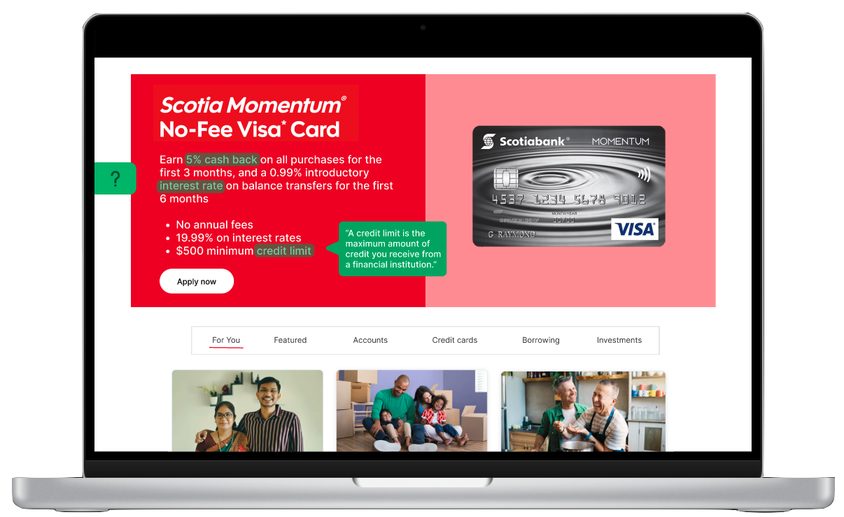
In the mockup, for example, hovering over credit limit or interest rate triggers a small, non-intrusive pop-up explaining the term in plain language, all without leaving the page.
During testing, we faced a key challenge: How do we balance information density with visual simplicity. Early prototypes overloaded users with too many highlighted terms, making pages feel cluttered. We resolved this by :
• Limiting pop-up definitions to only essential terms.
• Introducing a "Learning Mode" toggle so users can enable or disable the feature.
• Using consistent visual cues (green tooltips) to maintain clarity and trust.
This approach keeps the experience educational yet intuitive, helping newcomers learn at their own pace while browsing familiar product pages.
Increasing Sustainability
Sustainability in this context meant empowering users to make informed decisions without unnecessary waste time, effort, or resources.
We designed a personalized product carousel that recommends Scotiabank newcomer programs and credit cards based on user needs and priorities. Instead of generic promotions, users receive curated, educational recommendations that match their financial goals.
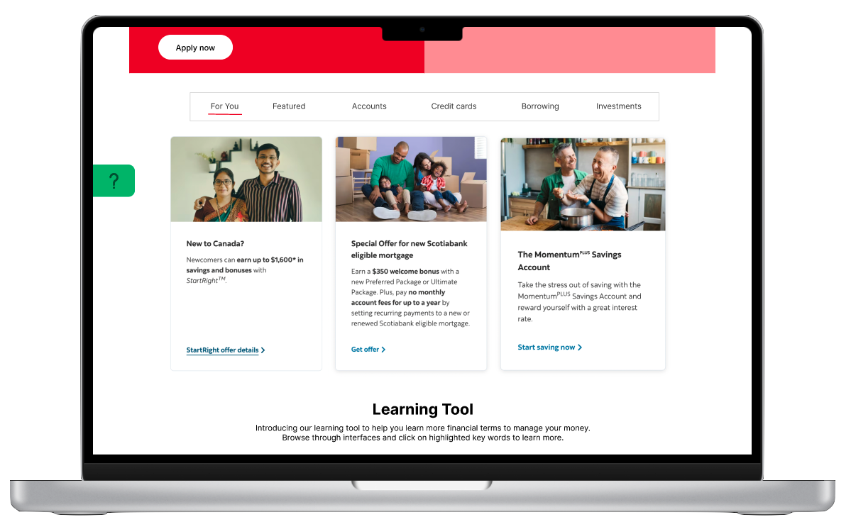
For example, a newcomer student might see resources for international students first, while a new permanent resident might be directed to the StartRightProgram. This not only improves relevance but also reduces digital clutter, making the user journey more efficient and sustainable.
Outcome
With Scotia Empower, we can improve the quantity and quality of visibility of the products and services. Customers will be connected with proper products and increase the economic sustainability of our custoemrs by educating them ofthecommonly-used terms in Canadian banking system.
This project placed 3rd out of 10 finalists that were invited to compete.